Reasons to Use Animations in Mobile App Designs
Mobile app animations are what give life to the overall design. It creates a unique sense that a static design surely cannot. For example, a smooth parallax transition going from one screen to another or a simple micro-transition of a burger menu turning into an “x” creates a truly interactive user experience.
Not only does this enhance the aesthetics of the design but there are lots of functional usages that can be created from these animations. Below is a list of examples that showcase this.
Transitions
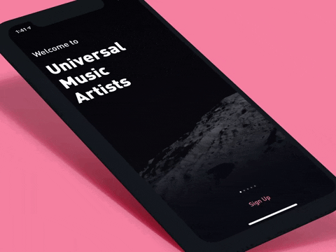
Transitional animations like this onboarding app for the UMA’s adds a simple, refined feel. Notice how each swipe introduces a new screen with multiple micro-transitions. The header text flows in from the right, which simultaneously moves with your finger while you’re swiping that direction. The data/secondary elements come in with its own set of progressing animations and the subtle background has a growing parallax effect that ties up everything nicely.
Doing all of this correctly with the right blend of animations will yield positive experiences for the user.
Pull-to-Refresh
A common yet great way to show off refreshing a screen to load in new data is the pull-down interaction. This example shows how intuitive it is to just swipe down, hold for a second and release. A set of squares animates and shows progression while the cards below have a general wireframe that depicts the upcoming content that is being loaded in.
Notifications
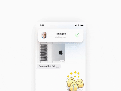
This is a tricky one. The idea is to have a great looking design and animation that is not obtrusive. Usually, we’re prone to seeing modals that overlay the entire screen or a banner graphic that is taking up half the real estate. Both instances give the user a negative experience.
We can fix that by doing something like the example below. Notice how soft and light the notification comes in. It has a graceful animation that gives off a non-obtrusive feel. The design itself further helps that with a subtle drop shadow.
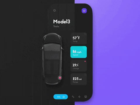
All Out Eye Candy
This is the ultimate goal and to flex on how your app is better than most. Combining intuitive functionality with beautiful designs and sick animations while having all phases work in unison is the holy grail. Below you’ll see how bringing these elements together truly creates a wonderful experience that will surely keep the users engaged throughout the app.
These are just one of many ways you can incorporate animations into mobile design. Always ask yourself why you’re adding interactions and if it’s creating a positive or negative experience. A few advantages of adding animations are to increase usability, provide feedback to the user, save screen space, create an immersive atmosphere, and ultimately bring your designs to life.