 Back
BackThree Methods for Styling Components in React Native
Whether you are just starting out with React Native and trying to learn how styling works in a new ecosystem, or you’re just trying to catch up on all the latest CSS_-in-JS_ buzz, you’ve come to the right place. I have worked on a number of React Native apps, and have used all of the most prevalent styling tools out there.
I’m going to share with you my own perspectives on each, and what I consider to be its pros and cons. Hopefully, by the end, you will have a better picture of the options available and can make your next styling tool choice from an informed perspective.
Stylesheets and the Style Prop
The place to start is going to be the “out-of-the-box” solution for styling components in React Native, the style prop. There are no .css files or classNames in React Native, but instead “style objects” are passed directly into the style prop of the components provided by React Native:
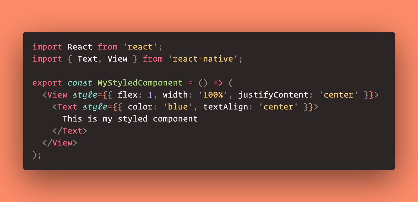
Styling a component via the style prop
Just from the trivial example shown, it’s clear that a major drawback of this approach is its verbosity, and how much physical space our style definitions can take up in our JSX. Also, there’s no strategy for code re-usability inherent in this approach.
React Native has a special tool, StyleSheet for defining styles outside of the JSX, and then using them by referencing the keys of the styles object that StyleSheet provides:
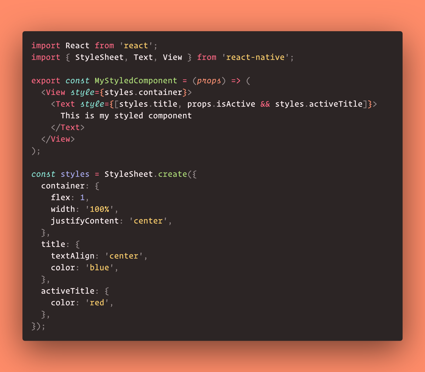
Moving styles into a Stylesheet
The keys of the StyleSheet are very similar to classNames in a traditional web context, which reduces the code profile in our JSX, as well as facilitates re-use of styles. Also shown in the example above is a pattern for updating styles based on props, which is an invaluable pattern in component development.
While stylesheets let us clean up our JSX and are generally a better practice, they still don’t solve code repetition between files unless you move your styles into centralized, external locations in your codebase. This then brings up another pain point of mentally remembering the styles contained in your stylesheet as you’re working in your JSX. While you can still have high-quality apps and clean codebases using these out-of-the-box tools, it is a somewhat mentally fatiguing process for writing and maintaining styles.
Styled-Components
Styled-components is the premier library for using CSS-in-JS. With styled-components, there are no stylesheets and no style props. We use template-literal strings to define CSS blocks within component definitions. The names of the components with the styles applied then lead to highly semantic JSX in our render method, aiding in the readability of our code:
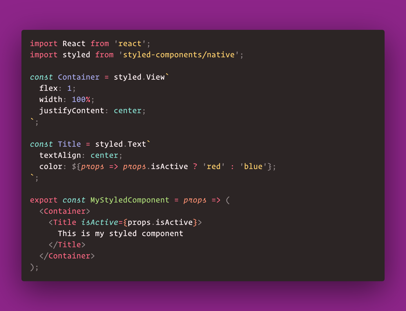
Styling components with styled-components.
Note that we are no longer importing React Native component primitives, but instead accessing them from the styled object. Notice how we are now computing styles based on props. I find this pattern very useful for common UI states which follow an either/or pattern. We can also use the styled object as a function, to add new styles to an existing component:
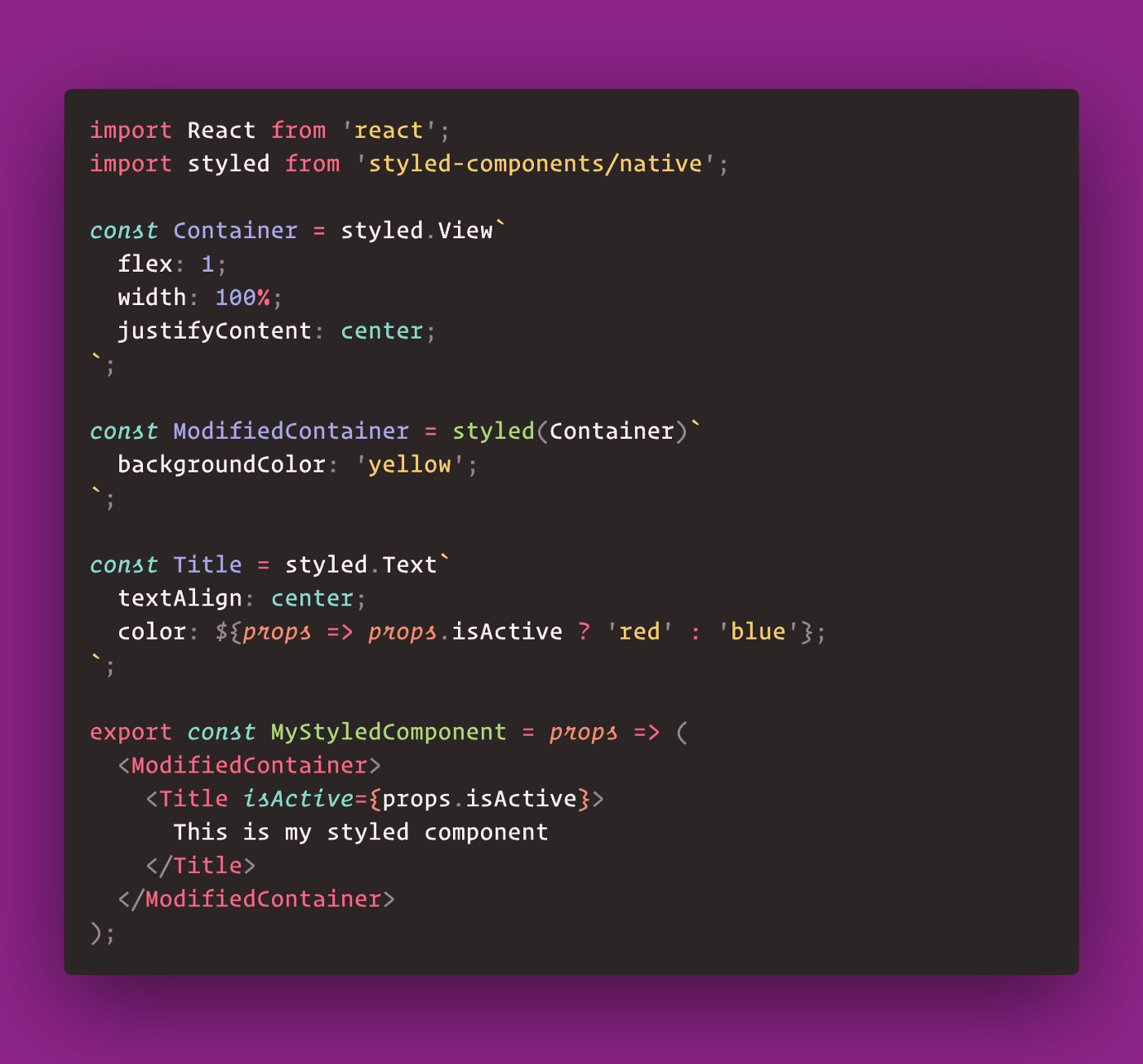
Adding new styles to Container with ModifiedContainer
Styled-components isn’t the only library for providing this powerful CSS-in-JS utility; Emotion is also very popular. Styled-components make code easier to read, and easier to work with (in my opinion). The only real criticisms I have of styled-components are the lack of style re-usability and the corresponding bloating of our files with lots of verbose style definitions. Also, a cognitive bridge is still required in the developer’s mind between the name of the “styled” component and the styles themselves when working in the final JSX output.
Styled-System
So far neither of our styling options has provided us with a clear solution to an inevitable problem of a scaling codebase: style consistency. It is very common to define a central “theme” file with style values defined for different layout scenarios, but this is a lot of extra work for the developer to maintain and to enforce consistent usage. This is one of the issues styled-system solves.
The other issue styled-system solves is the one intrinsic in both the “stylesheet” and “styled-components” style methodologies: when working on styles, a cognitive map needs to be held between the style objects and the JSX. Ironically, styled-system can almost be viewed as a step backward, to having the styles defined directly within the style prop object of our primitive React Native component JSX.
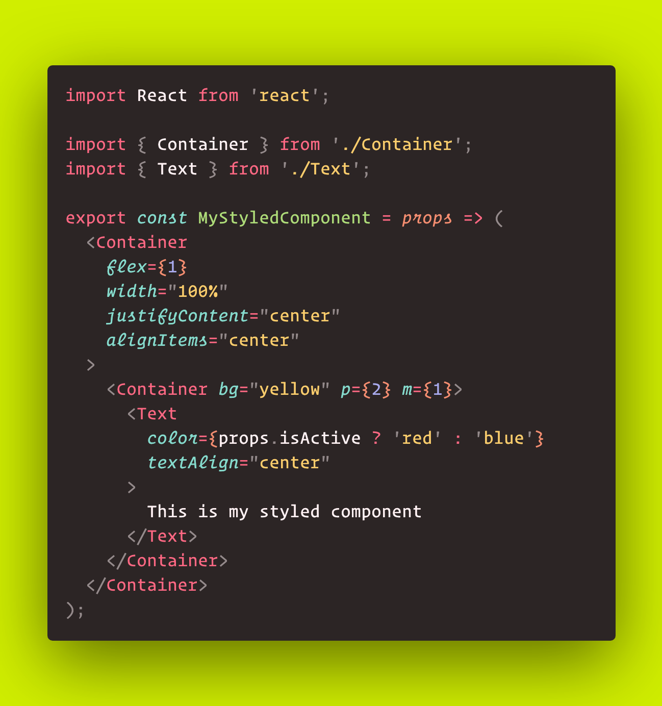
Styled-system is, in essence, a toolkit that allows you to overload components with extra props that represent subsets of available CSS styles, and to parse those values from a centralized provider. This allows you to apply styles directly as props in your JSX, as well as use special shorthands that compute to values in your theme definition.
Styled-system requires a bit of setup and actually requires that you add a CSS-in-JS library as well (such as styled-components or emotion). It would be more accurate to think of styled-system as a super-layer on top of styled-components, or whatever CSS-in-JS library you prefer. The first thing you would do is to define a new styled-system component, which overloads an existing component with new style props:
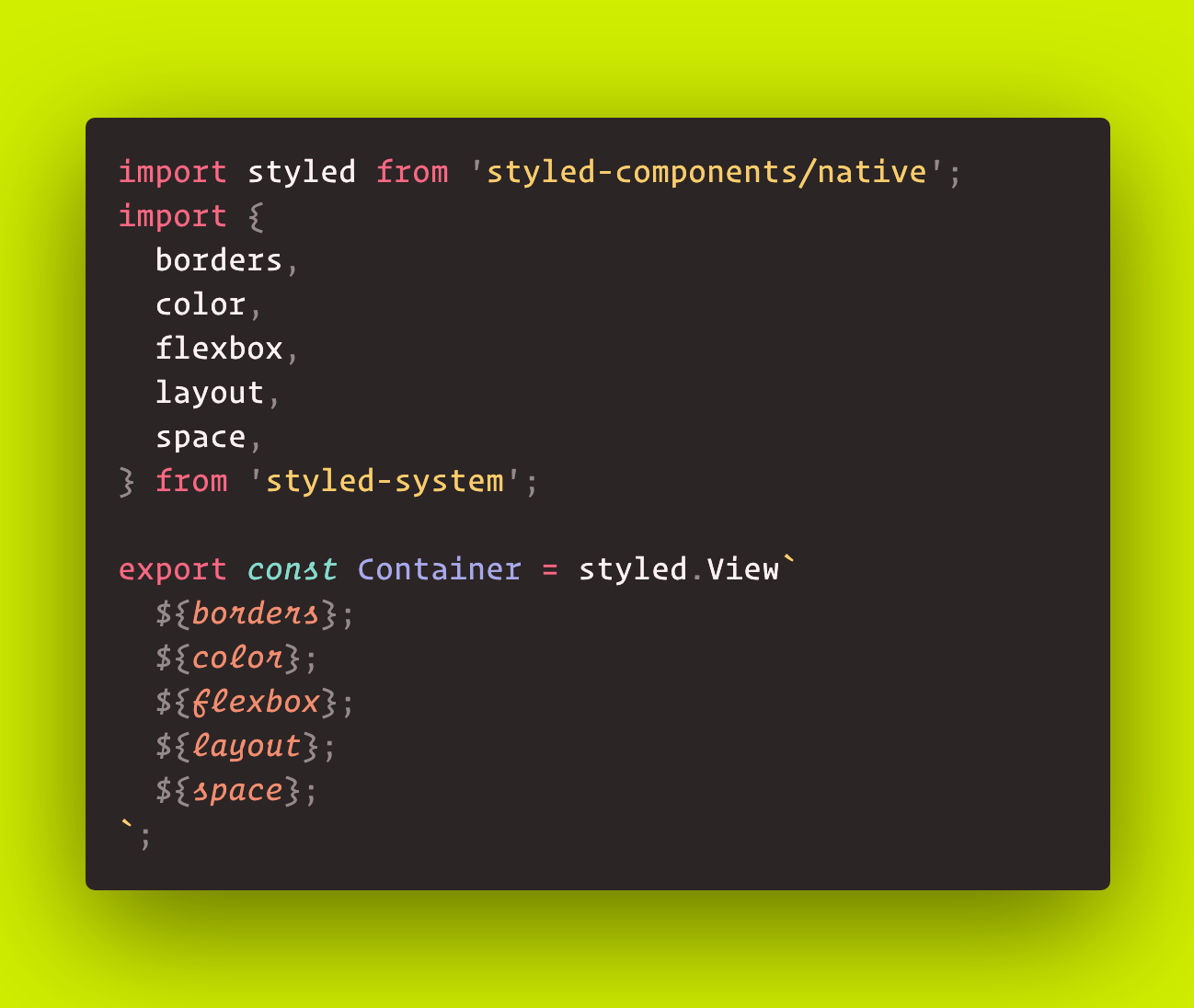
Creating a new styled-system View component
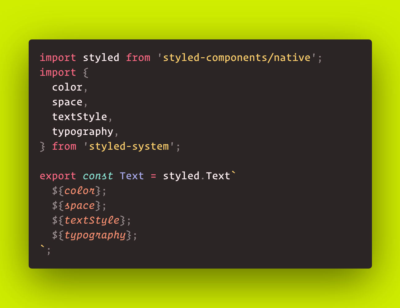
Creating a new styled-system Text component
And then back in our component, we can import the new Container, as well as the similarly overloaded Text component, and start using the style props provided by styled-system:
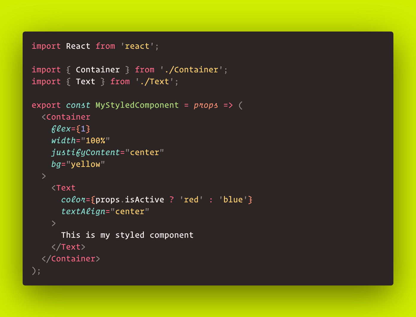
Adding styles directly as component props
I can understand if this method of styling is off-putting to those who are attached to the lean and concise JSX provided by styled-components, however, in my experience this method allows for much faster development speeds than either of the previous methods. The syntax is easier to write than the inherent style-objects of React Native and keeps our styles in the JSX itself, so less “mental-bridging” is required.
Notice the bg prop on the Container. This is shorthand for backgroundColor, and just one of many shorthands provided by styled-system. In practice, I typically only define a few “primitive” components which receive my styled-system props and build all other components from these few. A potential criticism is the mixture of style and data props. In actual usage, however, I find it is actually quite clear which props represent styles and which represent actual component data. “Primitive” components will be loaded with style props, while my more complex components will primarily be receiving data props.
Another amazing feature of styled-system is the combination of theming with the custom style props. Utilizing the ThemeProvider from styled-components (or emotion), we can predefine scaling values and then access them with shorthand syntax provided by styled-system.
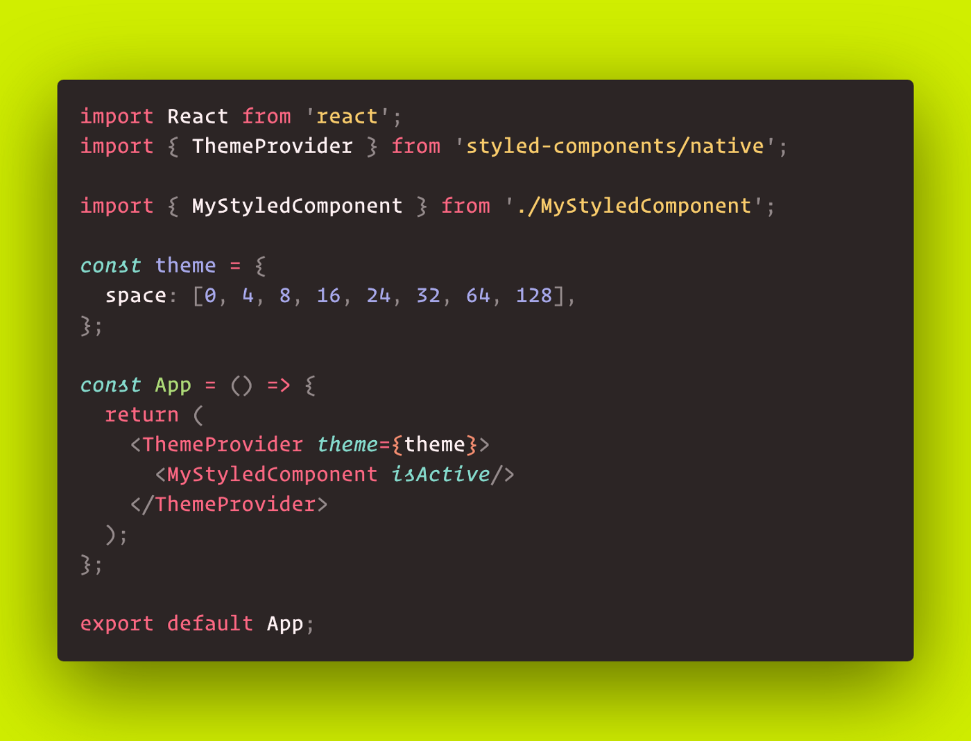
Wrapping our component tree in a ThemeProvider
Notice in our theme we define a space array, which contains a set of integers. These will be the values that the ${space} props from styled-system pull from. These will translate to the padding and margin values on our styled-system component:
Accessing the “space” values of our theme in the padding and margin shorthand props
Note the p and m props on the inner Container. These are shorthands for padding and margin (similar to bg). When we give them a value less than the length of the space array in the theme, it will pull the value at that index from the theme; otherwise, it will use whatever you pass in.
i.e. p={4} will compute to theme.space[4], while p={30} will just be 30.
Styled-system makes component development fast while making theming easy. Styled-system is also very flexible. You can use it without a theme, and you can opt-out of using the shorthand style props in favor of the more conventional style names. Any way you use it though, once you get past the small initial learning curve, I find that this facilitates very rapid UI development.
Bonus: Boolean Style Props
Disclaimer: This technique is my own creation and not at all endorsed by any of the aforementioned libraries ⚠️.
Boolean style props are a styled-system meta-pattern that resulted from looking at my code and seeing the same groups of styles applied over and over. You can think of them as being similar to “global CSS classes”. For instance in React Native, where everything is a flexbox, I found that the vast majority of all of my layout components received the same set of props:
flex={1}
width="100%"
justifyContent="center"
alignItems="center"
Since one downside of styled-system is the same downside of the inherent React Native style props, JSX bloating, I decided to make these applicable via some extra shorthand props on my Container component:
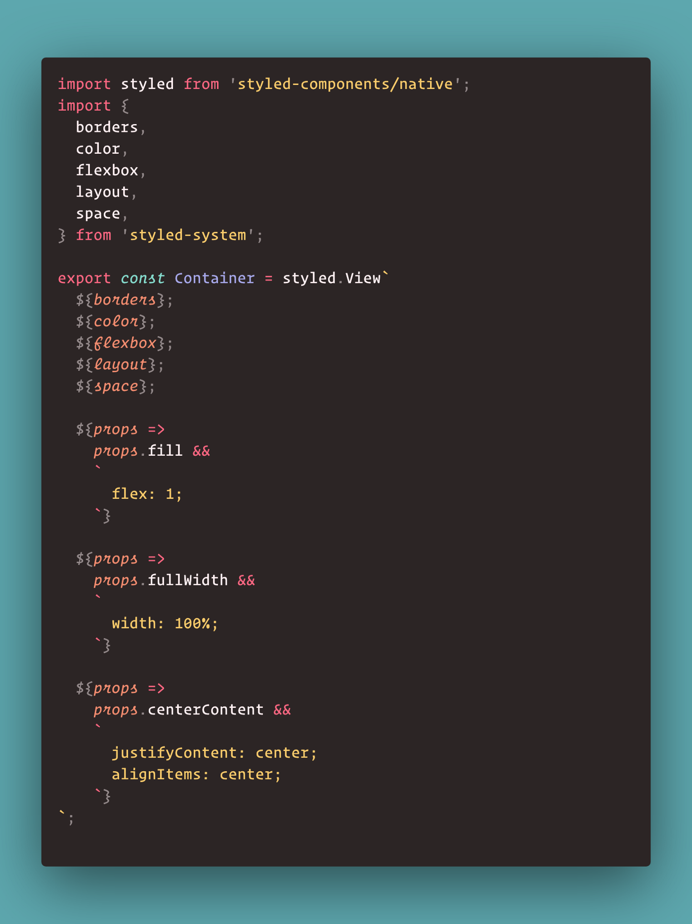
Adding boolean style props for globally-accessible, predefined style chunks
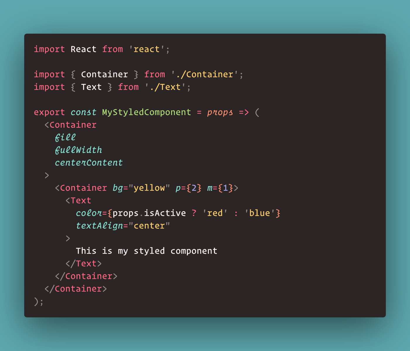
Using our new boolean style props for clean code
I find that with this custom pattern in place for any heavily repeated styles, the resulting JSX becomes nearly as clean as that provided by a pure styled-components implementation. If you really liked this pattern you could add as many custom styles as you wanted to, but personally I strive to add as few as possible. Also, I keep them completely devoid of app context and make sure they stand in abstraction. For example, I would make a blueBackgroundprop, but not a homepageBackgroundprop. This ensures styles remain robust and reusable.
Closing Notes
Arguments can be made for all of the component styling methods that have been discussed, but at the end of the day, I would recommend just trying them all and seeing what works best for you. Each will come with its own tradeoffs, and it’s up to you to decide which you’re ok with. Maybe you just want to leverage as few external libraries as possible and the out-of-the-box utilities are good enough for you. Or you want the benefits of styled-components, but styled-system is more structure than you need. I know when I went to go setup styled-system the first time I was deeply irritated at having yet another js library that I had to figure out, but once I started building things with it I couldn’t imagine ever going back.
Documentation links for setting up and using the referenced libraries:
Stylesheet (facebook):
https://facebook.github.io/react-native/docs/stylesheet
Styled-components:
https://www.styled-components.com/
Styled-components for react-native:
https://www.styled-components.com/docs/basics#react-native
Emotion:
https://emotion.sh/docs/introduction
Emotion for react-native:
https://emotion.sh/docs/@emotion/native
Styled-system:
https://styled-system.com/
Learn more about our React Native capabilities.